Brand
The Cerulean Standard
Cerulean’s visual identity has been designed with the same precision and intentionality that defines the luxury industry it serves. These guidelines exist to ensure that every representation of the brand, across every medium and partnership, maintains the integrity of that standard.
If you are a member of the press, a publishing partner, an affiliate, or an agency seeking to reference or feature Cerulean in your work, these guidelines govern the correct use of our brand assets.
The Colour
The brand takes its name from cerulean blue, a colour whose provenance in fashion and the fine arts is unmatched. Its story begins in 1872, when Impressionist master Pierre-Auguste Renoir chose cerulean as the defining hue of La Parisienne, painting an opulent Parisian gown in the rare, cobalt-and-tin pigment that was then among the most expensive a painter could select. Over a century later, it became the focal point of the most iconic scene in fashion cinema: Meryl Streep’s Miranda Priestly, in The Devil Wears Prada, delivering a withering monologue on the journey of a cerulean sweater from Oscar de la Renta’s runway to a clearance bin, a colour that “represents millions of dollars and countless jobs.” Derived from the Latin caelum, meaning sky or heaven, cerulean has always carried an air of the celestial. It is fashion’s most symbolic colour, and the natural namesake for a platform built at the intersection of luxury and careers. Read the full story of cerulean blue →
Wordmark
The Cerulean wordmark is a bespoke, proprietary logotype and the primary visual identifier of the brand.
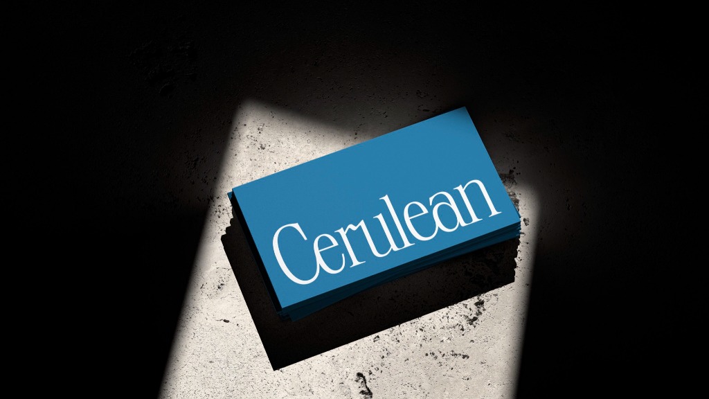
Customised with an elegant gestural ligature between the “r” and “u” as well as connecting serifs, the wordmark exudes an air of trust, grace, and sophistication.
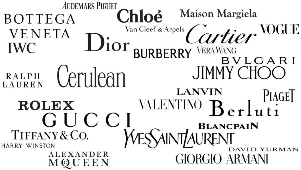
The mark balances effortlessly old-world aesthetics with modern flair, positioning the brand seamlessly alongside its peers in the luxury fashion industry.
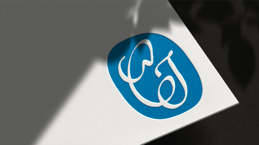
Monogram & Ellipse
Accompanying the wordmark is the Cerulean monogram; a fluid union of the letters C and J for “Cerulean Jobs”, rendered in a bespoke cursive hand that harkens to the old maker’s engravings found in some of the earliest branded pieces in history. It serves as a secondary identifier for contexts where the full wordmark is impractical.
The monogram is frequently presented within a cerulean blue cartouche — an ellipse whose form is familiar and evocative of the fashion landscape, drawing inspiration from watch cases and the insignia of vintage luxury houses. The resulting symbol carries a chiseled, textural quality that gives it an artisanal character, as though it were stamped or engraved rather than merely printed.
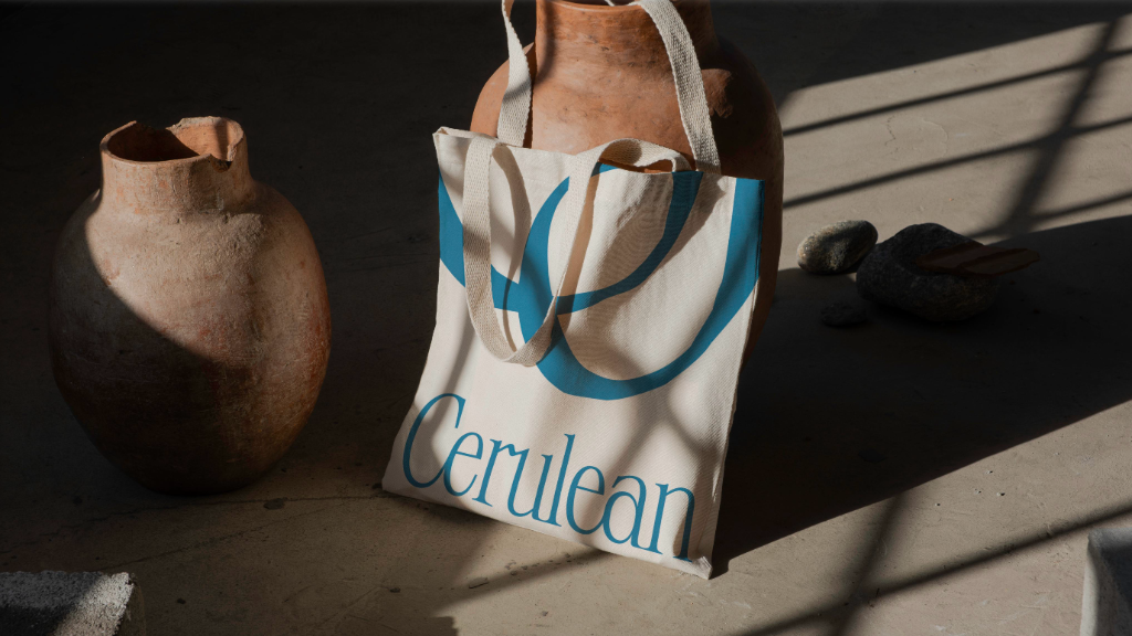
Icon Gesture
Beyond its role as an identifier, the Cerulean monogram also serves as a decorative device. Rendered at large scale and cropped, it brings forward the textural and gestural qualities of its engraved forms, adding depth and visual interest to surfaces, backgrounds, and branded materials.
Site-wide footer background
Luxury Job Search background
This visual device also works great on industry swag.
Colour Palette
Cerulean’s colour system is built around five named families, each extended into a full tonal scale for use across the platform. The base value of each family is indicated below.
| Linen | Canvas | Denim | Cerulean | Leather | |
|---|---|---|---|---|---|
| 950 | ● | ||||
| 900 | |||||
| 800 | |||||
| 700 | ● | ||||
| 600 | |||||
| 500 | |||||
| 400 | |||||
| 300 | |||||
| 200 | ● | ● | |||
| 100 | |||||
| 50 | ● |
Typography
Cerulean’s typographic system uses two custom, complementary typefaces:
Cerulean Serif
The art of
luxury, refined.
Aa Bb Cc Dd Ee Ff Gg Hh Ii Jj Kk Ll Mm Nn Oo Pp Qq Rr Ss Tt Uu Vv Ww Xx Yy Zz
Used for display headings, founder communications, and editorial contexts. Its classical proportions and warmth reflect the heritage dimension of the luxury world.
Cerulean Sans
Precision in
every detail.
Aa Bb Cc Dd Ee Ff Gg Hh Ii Jj Kk Ll Mm Nn Oo Pp Qq Rr Ss Tt Uu Vv Ww Xx Yy Zz
Used for navigation, body text, labels, and UI. Its clarity and legibility at all scales make it reliable across environments.
Downloads
For approved use by press partners, publishers, and affiliates. All assets are provided in a myriad of vector and raster formats.
Please direct questions regarding brand usage to luxury@ceruleanjobs.com.
August Strategy
Cerulean’s brand identity was developed in collaboration with August Strategy, a Montreal-based boutique brand agency that specialises in building dynamic brands crafted with purpose and designed for impact. Their cross-category expertise and grounded, actionable approach to strategy made them a natural partner for a platform that demands the same precision from its brand as it does from its technology.
Working closely with Cerulean’s founder, August Strategy distilled the platform’s positioning into a cohesive visual and verbal identity — from naming and brand voice to the full visual identity system documented on this page. Their process reflects a conviction that a strong brand is built on strategy, positioning, and execution — not just aesthetics — and that every touchpoint should work in harmony to elevate, connect, and resonate with its audience.
The partnership was led by Katie Green (Brand Strategy) and Gabriel Dufresne (Design & Development). As a boutique agency intentional about the projects they take on, the same seasoned professionals who shaped Cerulean’s brand strategy were the ones who executed it — ensuring dedicated attention and continuity from concept to completion.
To learn more about August Strategy and their work, visit auguststrategy.com.